Zine Making- Process
Our Zine was about the 20th Century Designers: Robert Brownjohn, John Alcorn and Saul Bass.
We started by looking at interesting ways to fold so we could begin to have a layout set. After numerous attempts I found this type of folding on Pinterest and our group tried to replicate it the best we could.


After being able to understand the way of the folding, we started to create the grids of the folds with Indesign, already having ideas for the actual layout of the zine.

When we had the grids set up and everything planned, we did some mood boards and send them to each other to kind of compare the themes and create a relationship between them. We reached a conclusion that both of my peer’s designers were influenced by Saul Bass (mine) and that all of our designers were very known for their colour palette- Black and Primary Colours. So to mix each other’s characteristics we decided to have our zine only in white, black and a tone that related to everyone: A variation of a primary colour- Yellow-ish= Orange/Creme.
When done with the research we moved on to actually start planning (through sketches) for the layout of our essays, thinking about the way the zine would fold and what would be visible when closed:


After the planning we started doing the actual proper text layout:

but we found it quite hard and confusing to read, as it basically had no structure and no indication for how it was supposed to be read, so we tried again and printed a mockup to see how it would layout:


After cleaning it and set some kind of structure we started laying out some pictures that related with each name. The typefaces for each designer name were carefully chosen, each one being related to their style, for example Saul Bass’s name was written in a cut-out-type-of typeface, relating to his hand-cut-out design style.

To set a mood for our zine we decided to apply the colour palette to the images:

For the back of the zine we wanted to do some kind of montage of all of our designer’s work we could use (depending on copyright rules), focusing on the way the zine would fold and what would be visible when closed. Saul Bass’s “Vertigo” poster is placed in the middle to kind of create a rotating illusion when folding the actual zine and also because Saul’s work was one of Robert Brownjohn and John Alcorn’s influencers.

Final Zine Layout ready to print:


(and here’s the pdf file)
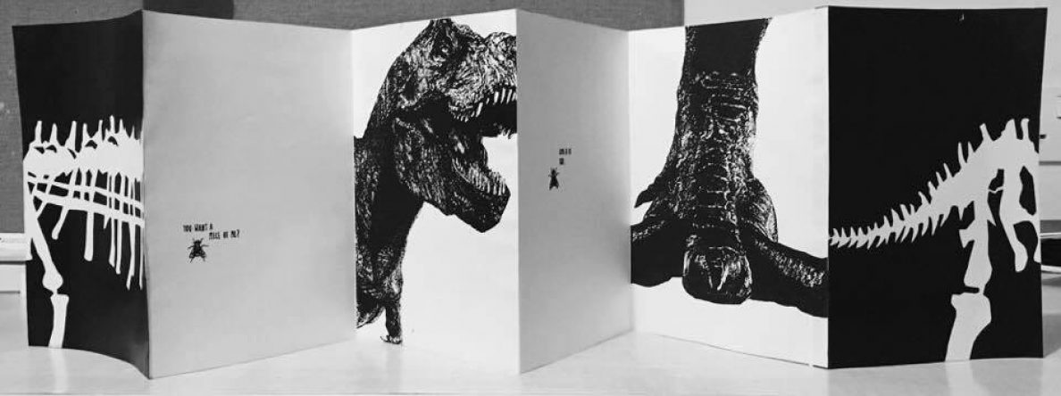
After printing it, here’s how the zine looks like closed (front and back) and whilst opening:


And finally, here a gif of how the Zine folds:

Lees-Maffei and Houze (2014) – Essay in 5 sentences
1) The present has no time to become familiar with the half-imposed benefits and to master them.
2) Our best things are more or less faithful reminiscences.
3) The abundance of means is the first great danger with which art has to struggle.
4) Practise wearies itself in vain in trying to master its material
5) What we should learn from non-European culture is the art of catching those simple melodies in form and colour.
Book Reference
Lees-Maffei, G. and Houze, R. (2014). The design history reader. 1st ed. London: Bloomsbury, pp.55-59.
Essay plan-How historical ideas of design are still relevant today
Introduction: 70 words
- Talk shortly about his past and beginning- His father influenced him to be creative and to draw. Addressing the question- Why I chose Saul Bass, formulating an argument- how I will answer the question.
Body: about 1900 words total- the argument
P1- 154 words
Historical and Socio-Political Context:
- What was happening at the time?
P2- 1776 words
Designer Developments and Style Characteristics:
- How he started- His classes, things he was learning. Who were the famous designers at the time and how did they influence Bass? The reason behind his style- He had a professor György Kepes who was a Bauhaus master; The reason behind his decision to start exploring title-sequences and its importance- People’s reactions to his style and ideas- Was he scoffed or was it considered brilliant?
- Materials/Process. Analyse 2 of his best works. One of his firsts and one of his lasts, one of them you have to really delve into that analysis- To talk about his evolution.
- Compare them to 2 contemporary ones. Talk about the pioneering aspects of his design (colour, style, lines, structure, minimalism) and some contemporary designers/companies he influenced to demonstrate his importance.
Conclusion: 64 words
- An informed judgement about the argument, based on the research and points made.
Bibliography- research and reference links (search them on citethemright)
Bass, J. and Kirkham, P. (2011) Saul Bass: A Life in Film & Design. London: Laurence King Publishing Ltd. -for the introduction and some analysis of his work
Horak, J-C. (2014) Saul Bass: Anatomy of Film Design. Available at: https://play.google.com/store/books/details/Jan_Christopher_Horak_Saul_Bass?id=WmnaBAAAQBAJ (Downloaded: 4 February 2017). -his influences and how he created his style
Roberts, C. (2015) Graphic Design Visionaries. London: Laurence King Publishing Ltd, pp: 12-15 and pp: 132-135 -a little bit about his past. Edward McKnight Kauffer’s life and graphic style (because he was an influence on Saul Bass)
Spencer, H and Poynor, R. (2004) Pioneers of Modern Typography. Cambridge: MIT Press.
Saul Bass-inspired designs in London Task
Afroditi Krassa Studio designed the interiors for Heston Blumenthal’s new restaurant, The Perfectionists’ Café, sited at Heathrow Airport’s Terminal 2, drawing influences from Saul Bass and Verner Panton.
The Perfectionists’ Café model and original.


Afroditi Krassa did her research for the designs by looking at Saul Bass’ work in the Continental Airlines’ 1968 jet stream logo and United Airlines’ 1974 tulip logo.
“The colourful, ironic and quirky influences of both artists can be seen in the artwork on the wall and colour palate: classic and warm, with a touch of wit and irony.”
says Founder, S. and Krassa, A. (2015) The perfectionists’ Café (Heathrow T2): AfroditiKrassa – restaurant & bar design. Available at: https://restaurantandbardesign.com/2015/03/17/perfectionists-cafe-afroditikrassa/

Saul Bass used mainly primary colours in his work, by looking at the colour palate of the restaurant you can observe his influence, making the whole place more interesting and vibrant, gaining the attention it seeks.
Referencing a Journal Article Task
Sherwood, P. (1998) ‘Is it a bird? Is it a Plane?’, Art Monthly, February (213), pp.30.


Image Analysis Task from the Royal Academy visit

The author of this abstract painting is Ad Reinhardt. At first glance all you can see is a large, neutral, black square, but once your eyes adjust to its darkness you can actually see the six small dark red and blue squares and that dark grey horizontal rectangle in the middle. Once you’ve noticed all these elements, you realise no pure black was actually used in this painting.
It has supposedly no composition and a matte, flat, textureless surface. This dark, almost black effect was used to slow down the experience of looking: To purposefully make us stop for a minute and really reflect on what is being presented in front of us, leaving the viewer with a sense of tranquility and calmness (not usually given by such dark tones).
Library Task 2
Book that relates with the chosen Designer- Saul Bass
Savage J. III, W. (2016) Streetcar Advertising *in America*. Great Britain: Fonthill, pp.84.

This book contains a range of different posters, all of them being advertisements of some sort. Saul Bass had his first connection/experience with Graphic Design through Ads he saw on the street like these, drawing them since a very young age.
Interesting Layouts
Tillmans, W. (2015) Abstract Pictures. Germany: Hatje Cantz Verlag, (no pagination), fig.203.

Webb, J. (2005) Creative Vision. Switzerland: AVA Publishing SA, pp.42-43.

-What inspired me to choose these two layouts: The beauty and the contrast of the figures, causing a reaction to the person seeing them.
Library Task 1
Leibovitz, A. (2006) A Photographer’s Life. New York: Random House, Inc, (no pagination).
These pages inspired me greatly. The ability to capture expressions and emotions always amazed me and that’s exactly what Annie Leibovitz is doing here. With the help of the outstanding actor Jim Carey, we can observe two actions of what I assume were driven by anger, sadness and frustration in the simplest scenario, making us (the viewer) focus on the real objective of the photographs. The reason I chose these two images presented below was because of the fact that this captures attention and makes the person seeing them feel something. I aspire to be able to transmit that with my work, no matter the media it takes form on.

Tillmans, W. (2015) Abstract Pictures. Germany: Hatje Cantz Verlag, (no pagination), Fig.105-107 & 108.
The reason these specific pages inspired me is because of their control. We can see a wild exploration of color and technique, all of that contained in small rectangles. Because of that composition the images appear to be clean, organized and aesthetically pleasing, therefore giving a sense of harmony to those paintings. In my work I was never able to achieve that. My paintings and drawings most of the time have no control and end up looking too expressive and what I plan to learn is exactly what this book is showing: Control, calm and harmony.

Steinberg, S. (1954) The Passport. United States of America: Hamish Hamilton, (no pagination), illus.
This entire book grabbed my attention, not only because I love illustration but due to its simplicity. The minimalism and cleverness exposed in these two illustrations below are outstandingly inspiring. I aspire to reach a point in my life where I’ve achieved this level of creativity and capability, making the simplest and most human of things like a fingerprint, a work of art. They may appear irrelevant, but these illustrations are screaming meaning, making us question our entire purpose and existence as human beings. Steinberg was a genius and will always give me motivation to make people think, even if they didn’t quite understand what they saw, at least they felt something.

